Basics of Statistical Analysis and Visualization using R
Introduction to the course outline
Table of Contents
Welcome to the Basics of Statistical Analysis and Visualization Using R seminar! This session is designed to introduce you to the fundamental concepts of statistical analysis and data visualization using R, a powerful and widely used programming language for data science.
In this seminar, you will:
- Learn the basics of R and RStudio, including how to write and run R scripts.
- Understand how to handle and manipulate datasets efficiently.
- Explore different techniques for analyzing data to uncover patterns and insights.
- Create stunning and meaningful visualizations using the ggplot2 package.
- Apply basic statistical methods to draw conclusions from data.
- Gain hands-on experience with real-world datasets through guided exercises.
By the end of this session, you will have a solid foundation in using R for data analysis and visualization, equipping you with essential skills for research, business intelligence, and decision-making.
Why is Statistical Analysis and Visualization Important?
In today’s data-driven world, raw numbers alone are not enough. Effective decision-making requires the ability to analyze and interpret data accurately. Statistical analysis helps us uncover trends, test hypotheses, and make data-backed conclusions. Meanwhile, visualization transforms complex data into easy-to-understand charts and graphs, making insights more accessible and impactful.
Whether you are a student, researcher, business analyst, or data enthusiast, mastering these skills will help you turn data into actionable knowledge.
Introduction to R and RStudio
What is R? Why Use It for Statistics and Visualization?
R is a powerful, open-source programming language designed specifically for statistical computing and data visualization. It is widely used by data analysts, researchers, and statisticians for handling, analyzing, and visualizing data efficiently.
Why choose R?
- Built for Data Analysis – R has a vast collection of statistical and graphical tools.
- Free and Open-Source – Available for anyone to use and modify.
- Strong Community Support – Thousands of packages are available for specialized tasks.
- Excellent for Visualization – Libraries like ggplot2 allow for beautiful, publication-ready charts.
- Compatible with Other Tools – Can be integrated with Python, SQL, and even Excel.
Installing R and RStudio
To start using R, you need to install:
1️. R – The core language for statistical computing.
Download from: https://cran.r-project.org/
2️. RStudio – A user-friendly IDE (Integrated Development Environment) that makes working with R easier.
Download from: https://posit.co/download/rstudio-desktop/
Installation Steps:
- Download and install R from CRAN (choose the version for your operating system).
- Install RStudio (ensure you install R first).
- Open RStudio and start coding!
Understanding the RStudio Interface
When you open RStudio, you will see four main panes:
🖥️ Console – Where you type and execute R commands.
📜 Script Editor – Used for writing and saving R scripts.
📊 Environment/History – Displays loaded datasets, variables, and command history.
📈 Plots/Files/Packages/Help – Used for viewing plots, managing files, and accessing documentation.
Running Basic R Commands
Let’s try some basic commands in R:
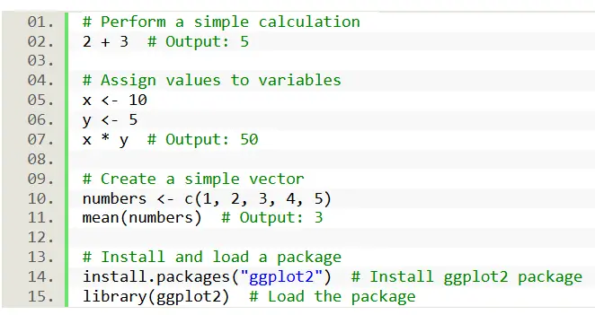
# Perform a simple calculation
2 + 3 # Output: 5

# Assign values to variables
x <- 10
y <- 5
x * y # Output: 50

# Create a simple vector
numbers <- c(1, 2, 3, 4, 5)
mean(numbers) # Output: 3

# Install and load a package
install.packages("ggplot2") # Install ggplot2 package
library(ggplot2) # Load the package
Basic Data Handling
Before we can analyze and visualize data, we need to understand its structure and learn how to manipulate it effectively. This section will equip you with the fundamental skills for handling data in R.
Understanding Data Types (numeric, character, factor, logical)
Data comes in various forms, and R recognizes these different types. We’ll explore the core data types:
- Numeric: Representing numbers (e.g., age, temperature).
- Character: Representing text (e.g., names, addresses).
- Factor: Representing categorical data with levels (e.g., colors, categories).
- Logical: Representing true/false values.
Understanding these data types is crucial for performing accurate analyses.
Creating Vectors, Matrices, and Data Frames
We’ll learn how to create the basic building blocks of data structures in R:
- Vectors: One-dimensional arrays of elements of the same data type.
- Matrices: Two-dimensional arrays of elements of the same data type.
- Data Frames: Tabular data structures with rows and columns, capable of holding different data types. Data frames are the most common structure you will use.
We will learn how to create these structures from scratch, and how to access and modify the data stored within them.
Importing Datasets (CSV, Excel)
Most of the time, data comes from external sources. We’ll learn how to import data from common file formats:
- CSV (Comma-Separated Values): A widely used format for storing tabular data.
- Excel: A popular spreadsheet format.
We’ll cover the read.csv() function and other relevant functions to import data into R, and discuss how to handle common import issues.
Basic Data Manipulation with dplyr (filter(), select(), mutate(), arrange(), summarize())
Once we have our data, we’ll use the powerful dplyr package to manipulate it. dplyr makes data manipulation intuitive and efficient. We will cover the core verbs:
- filter(): Selecting rows based on conditions.
- select(): Selecting columns.
- mutate(): Creating new columns or modifying existing ones.
- arrange(): Sorting rows.
- summarize(): Computing summary statistics.
Through practical examples, you’ll learn how to transform and reshape your data to prepare it for analysis and visualization. These dplyr verbs are essential for any data workflow in R.
Exploratory Data Analysis
Exploratory Data Analysis (EDA) is a crucial step in statistical analysis. It helps you understand the structure, trends, and patterns in your dataset before applying complex models. In this module, participants will learn how to summarize data, detect missing values, and analyze distributions to make informed decisions.
- Summary Statistics
Summary statistics provide a quick overview of key numerical properties in a dataset. Participants will learn how to compute basic statistical measures such as:
- Mean – The average value of a numeric variable.
- Standard Deviation (SD) – Measures how spread out the values are.
- Minimum and Maximum – Identify the range of values in a dataset.
- Frequency Tables – Count the occurrences of categorical variables.
By the end of this section, students will know how to summarize and interpret datasets efficiently using built-in R functions.
- Identifying Missing Values
Handling missing values is essential for ensuring data accuracy. Participants will learn:
- How to detect missing values in a dataset.
- The impact of missing values on statistical analysis.
- Different strategies to handle missing data, such as removing incomplete rows or filling missing values with appropriate estimates.
This section will help students make their datasets cleaner and more reliable for further analysis.
- Checking Data Distributions
Understanding the distribution of data is key to choosing the right statistical techniques. Participants will explore:
- Normal vs. Skewed Distributions – Understanding the shape of data.
- Outliers – Identifying extreme values that could affect analysis.
- Visualizing distributions – Using histograms and density plots to see how data is spread.
By the end of this module, students will be able to assess data distribution patterns and determine if any transformations are needed before conducting further statistical analysis.
This module will provide students with the necessary skills to explore and understand their datasets before applying advanced statistical techniques. By mastering summary statistics, missing value detection, and data distribution analysis, they will be able to clean and prepare data effectively for meaningful insights.
Data Visualization with ggplot2
Data visualization is a powerful tool for uncovering insights and communicating findings effectively. In this module, participants will learn how to create meaningful and visually appealing charts using the ggplot2 package in R.
- Introduction to ggplot2 and Aesthetics (aes())
ggplot2 is a popular R package for data visualization. Unlike basic plotting functions, ggplot2 follows a layered approach, allowing users to build complex visualizations step by step.
At the core of ggplot2 is the aes() function, which defines aesthetics—such as x and y axes, colors, and shapes—used to map data onto a plot.
By the end of this section, students will understand how ggplot2 works and how to define aesthetics to create dynamic and customizable plots.
- Creating Different Types of Plots
Participants will learn how to create essential visualizations:
- Scatter Plot (geom_point()) – Used to visualize the relationship between two numerical variables. Ideal for identifying trends and correlations.
- Bar Chart (geom_bar()) – Best for comparing categorical data by displaying the frequency or count of each category.
- Histogram (geom_histogram()) – Used to visualize the distribution of a single numeric variable, helping to identify skewness, peaks, and gaps in the data.
- Boxplot (geom_boxplot()) – Helps summarize the spread and distribution of a numeric variable while detecting outliers.
By the end of this section, students will be able to choose the appropriate plot based on their data type and research question.
- Customizing Plots
A great visualization is not just about plotting data—it should be clear, visually appealing, and informative. This section will cover:
- Themes – Adjusting the background, gridlines, and overall appearance.
- Labels – Customizing axis labels, titles, and legends for better readability.
- Colors – Enhancing visualization by changing colors for better distinction.
By the end of this module, students will be able to personalize and refine their plots, ensuring they effectively communicate insights to their audience.
This module will equip students with the skills to create visually compelling charts that make data interpretation easier. By mastering ggplot2, they will be able to turn raw numbers into insightful stories, making statistical analysis more impactful and engaging. 🚀📊
Basic Statistical Analysis
Statistical analysis helps transform raw data into meaningful insights. This module covers both descriptive statistics (summarizing data) and inferential statistics (making predictions and testing hypotheses). By the end of this session, participants will be able to analyze datasets and draw conclusions using statistical methods in R.
- Descriptive Statistics
Descriptive statistics summarize and describe the essential features of a dataset. Participants will learn to compute:
- Mean – The average of a numeric dataset.
- Median – The middle value when the data is ordered.
- Variance – Measures how spread out the data points are.
- Standard Deviation – Indicates the amount of variation in the dataset.
Understanding these measures helps in identifying central tendencies and variability, which are fundamental to data analysis.
- Inferential Statistics
Inferential statistics allow us to make data-driven decisions and predictions about a population based on a sample. This section covers key techniques:
Hypothesis Testing (t.test())
- Helps determine if there is a significant difference between two groups.
- Commonly used in experiments and A/B testing.
- Participants will learn how to interpret p-values and make statistical decisions.
Correlation Analysis (cor(), cor.test())
- Measures the strength and direction of a relationship between two numeric variables.
- Helps answer questions like: “Does study time affect exam scores?”
- Participants will learn to identify positive, negative, or no correlation in their data.
Simple Linear Regression (lm())
- Predicts the relationship between one independent variable (predictor) and one dependent variable (outcome).
- Used in forecasting, trend analysis, and understanding variable influence.
- Participants will learn how to interpret regression coefficients and R-squared values to measure the model’s accuracy.
By the end of this module, participants will be able to describe, analyze, and interpret data using statistical methods in R. They will gain hands-on experience in hypothesis testing, correlation, and regression analysis, making them confident in applying statistics to real-world problems. 🚀📊
Hands-on Exercises
This session will provide participants with practical experience in applying the concepts learned throughout the seminar. The goal is to reinforce statistical analysis and visualization skills using real-world datasets.
- Data Exploration and Cleaning
- Load a sample dataset (e.g., customer sales, student performance, survey data).
- Identify data types and clean missing values.
- Compute summary statistics (mean, median, standard deviation).
Learning Outcome: Participants will gain confidence in handling and preparing datasets for analysis.
- Exploratory Data Analysis (EDA)
- Generate summary tables and check data distributions.
- Identify outliers using boxplots.
- Detect correlations between numeric variables.
Learning Outcome: Participants will learn how to interpret trends, patterns, and anomalies in data.
- Data Visualization with ggplot2
- Create different types of plots (scatter plots, bar charts, histograms, boxplots).
- Customize plots (titles, labels, themes, colors).
- Compare different visualizations and discuss insights.
Learning Outcome: Participants will develop skills in creating professional and insightful visualizations.
- Statistical Analysis & Interpretation
- Conduct a hypothesis test (e.g., compare two groups using t.test()).
- Perform correlation analysis to measure relationships between variables.
- Build a simple linear regression model and interpret results.
Learning Outcome: Participants will apply statistical methods to draw meaningful conclusions from data.
Summary
In this course, we’ve equipped you with the foundational skills to leverage R and RStudio for effective data analysis and visualization. You’ve learned to handle and explore data, create compelling visualizations with ggplot2, and perform basic statistical analyses, all reinforced through practical, hands-on exercises. By understanding data types, mastering dplyr for manipulation, and grasping key statistical concepts like hypothesis testing and regression, you’re now prepared to transform raw data into meaningful insights, and are encouraged to continue practicing and exploring the vast resources of the R community.
You may visit our Facebook page for more information, inquiries, and comments. Please subscribe also to our YouTube Channel to receive free capstone projects resources and computer programming tutorials.
Hire our team to do the project.